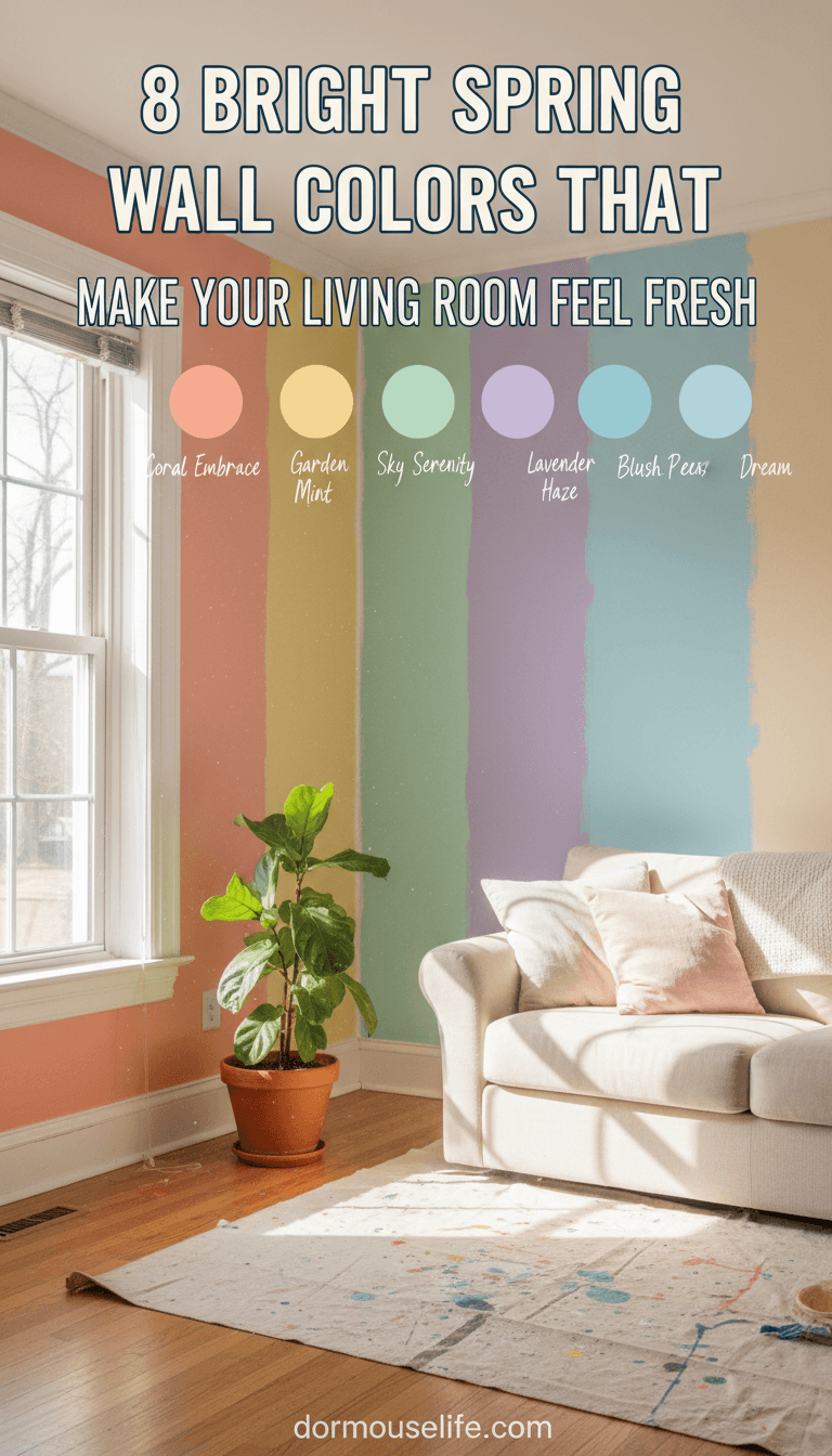
8 Bright Spring Wall Colors That Make Your Living Room Feel Fresh
Spring is the perfect excuse to refresh your living room and let a little more joy into your home. One of the easiest ways to do that is with color—specifically, bright, light-filled shades that instantly wake up your walls.
This post may contain affiliate links, which means I’ll receive a commission if you purchase through my link, at no extra cost to you. Please read full disclosure here.
Whether you’re drawn to soft pastels or bolder, cheerful hues, the right paint color can make your living room feel bigger, brighter, and more inviting. Here are fifteen spring-ready shades that bring in that fresh, open-window feeling all year round.
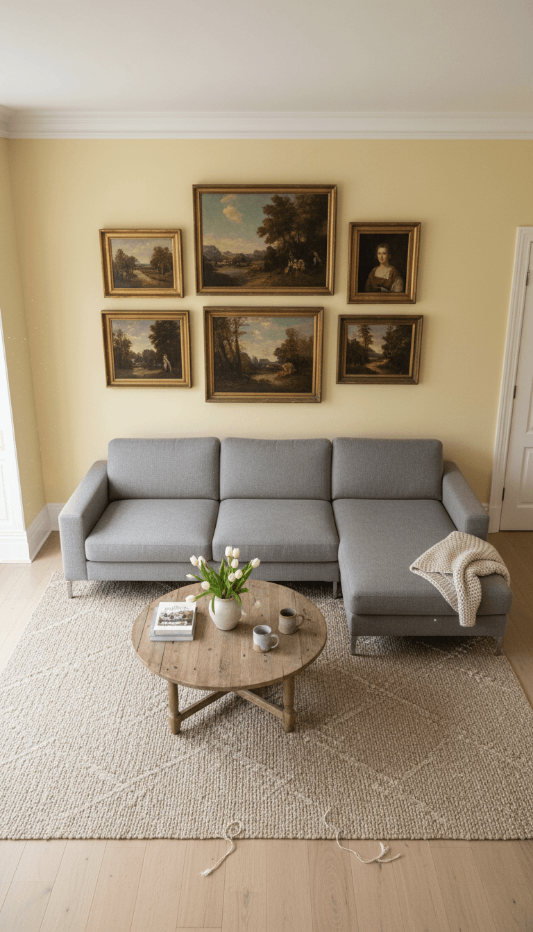
Sunny Buttercream Yellow
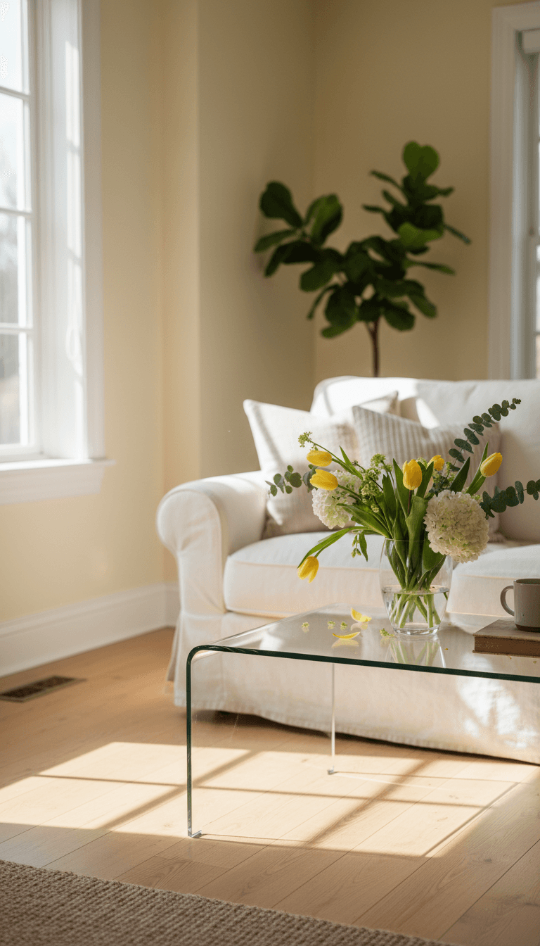
Buttercream yellow brings in sunshine without feeling loud, wrapping your living room in a gentle, happy glow. It pairs beautifully with white trim and natural wood, making the whole space feel soft, warm, and welcoming from morning to evening.
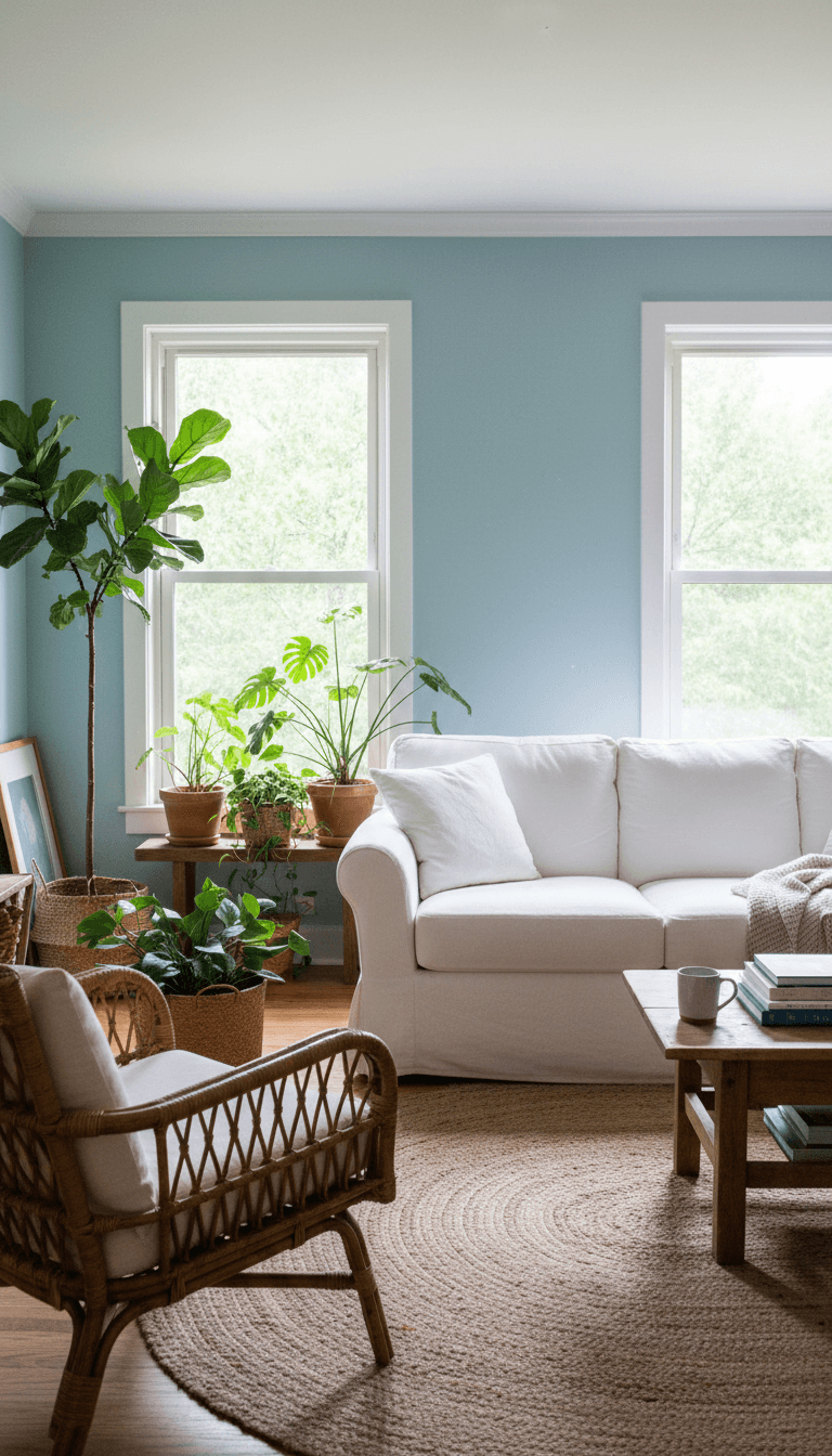
Soft Robin’s Egg Blue
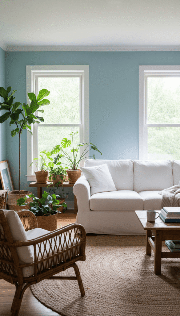
Robin’s egg blue feels like a clear spring sky, instantly calming yet cheerful. On living room walls, it balances brightness with serenity, especially when styled with white furniture, woven textures, and a few leafy green plants.
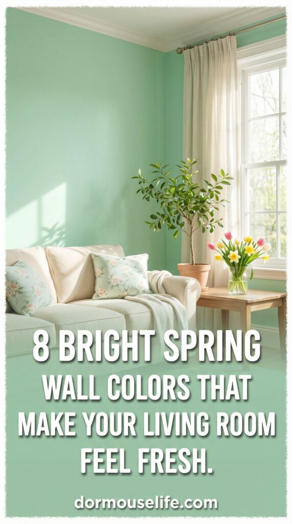
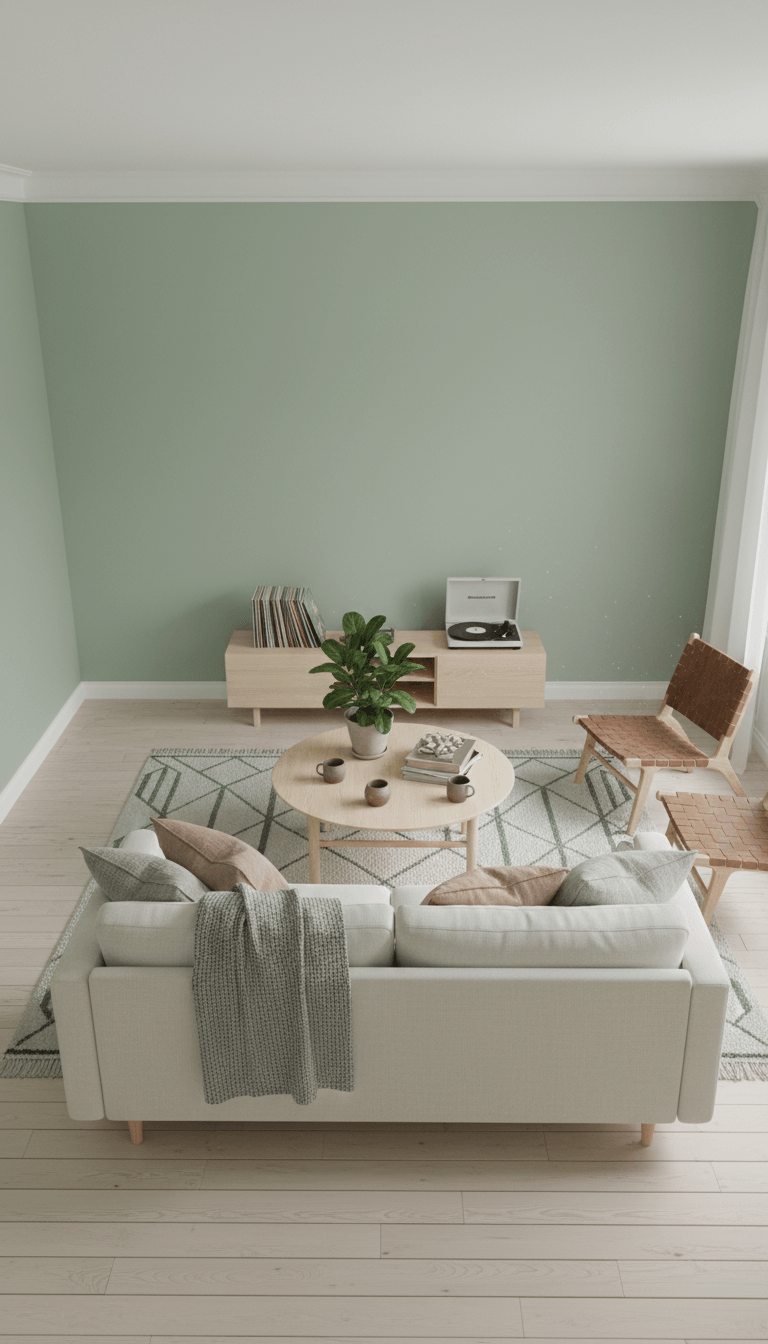
Fresh Leafy Green

A fresh leafy green mimics the first buds of spring, bringing the outdoors in with a vibrant, natural energy. It looks especially striking alongside warm woods, linen fabrics, and black accents for a grounded yet uplifting space.
Powdery Blush Pink
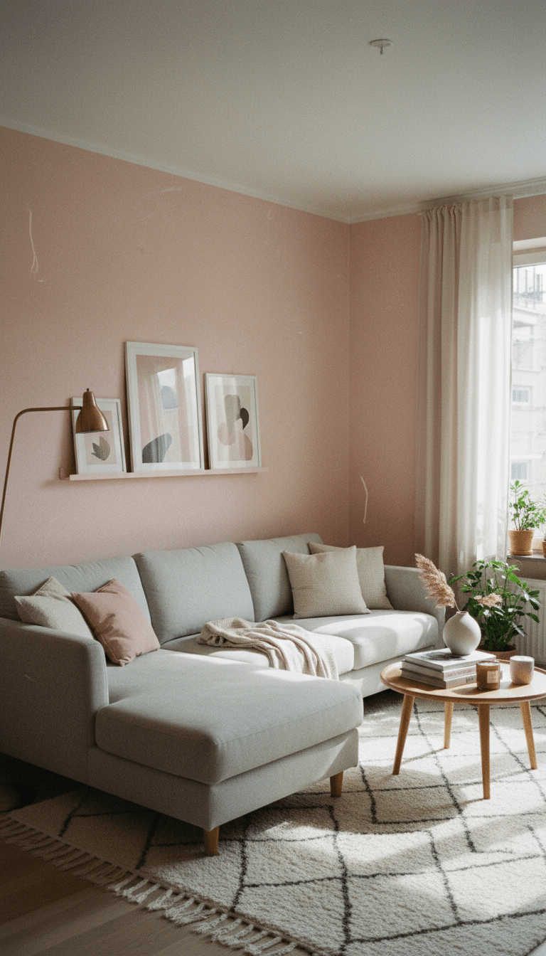
Powdery blush pink adds a soft, flattering glow to your living room, like golden hour light in paint form. It feels subtly romantic and surprisingly neutral, playing beautifully with grays, creams, and brushed brass details.
Warm Peach Sorbet
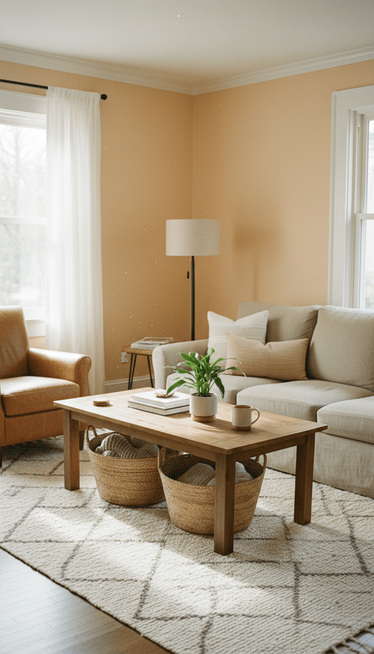
Peach sorbet brings a juicy, optimistic warmth that makes the whole room feel friendly and alive. It’s bright but not overwhelming, especially when balanced with crisp white trim, woven baskets, and light wood tones.
Light Pistachio Green
Light pistachio green is playful and refreshing, like a soft pastel that grew up a little. It keeps your living room feeling airy and modern, especially when paired with white walls in adjacent spaces and simple, clean-lined furniture.
Skyline Periwinkle
Periwinkle sits between blue and lavender, bringing in a breezy, slightly whimsical feel that still feels grown-up. On living room walls, it reflects light beautifully and works well with both cool grays and warm camel tones.
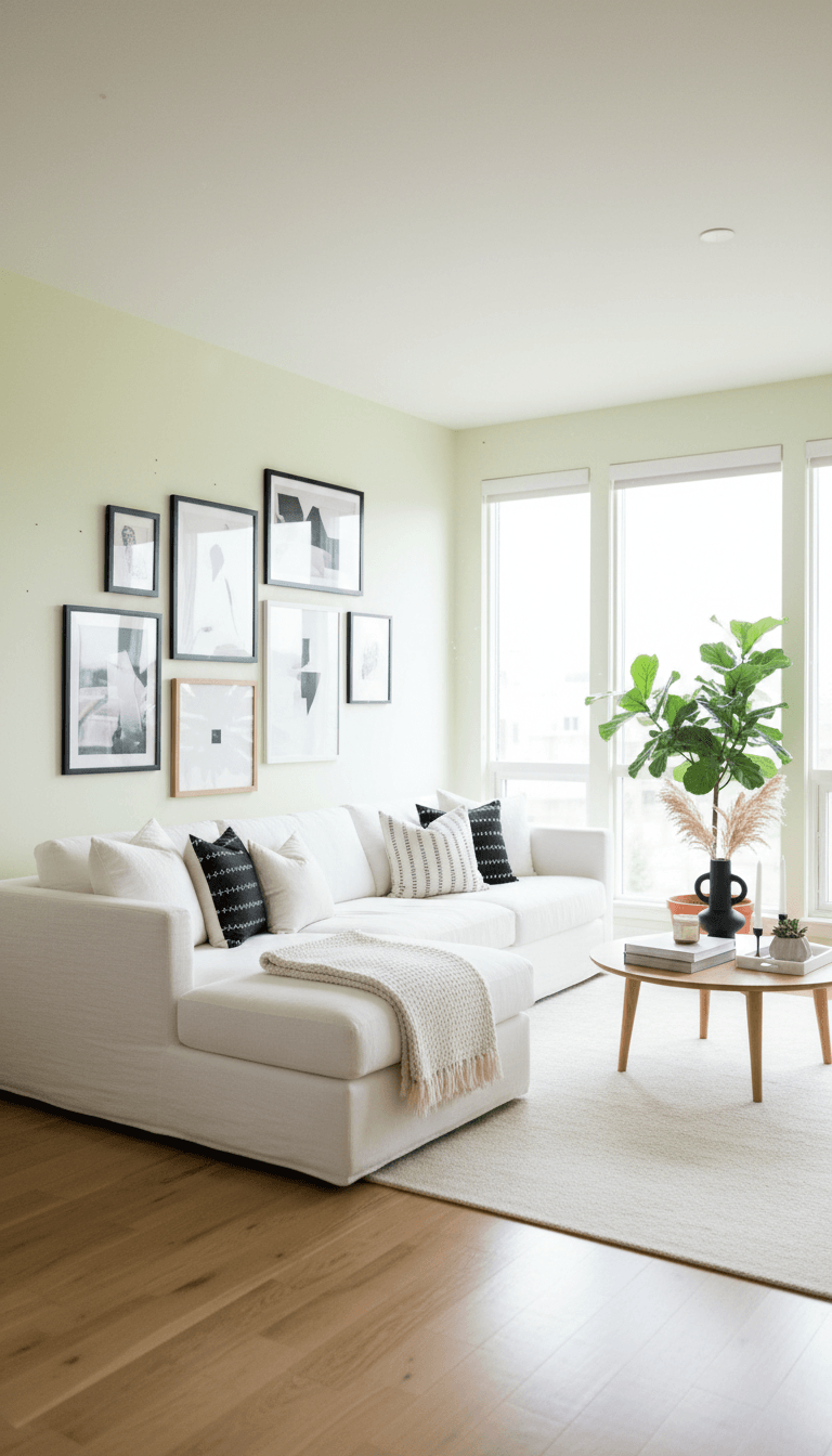
Crisp Spring White
A crisp spring white with a hint of warmth can make your living room feel like a blank, sunlit canvas. It bounces light around the space and lets your textiles, art, and greenery provide the season’s color and character.
Soft Lavender Mist
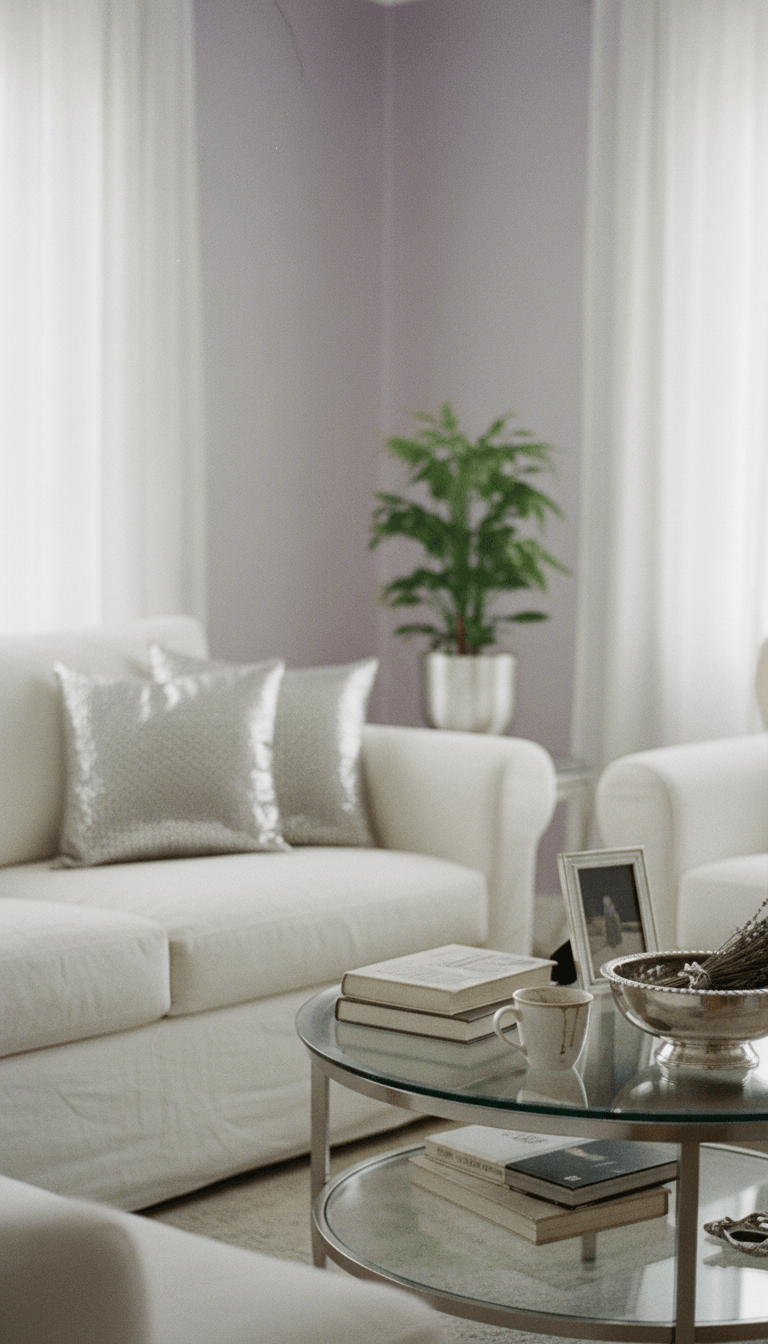
Lavender mist is a pale, breezy purple that adds a gentle sense of luxury without feeling stuffy. It’s especially lovely in living rooms with lots of natural light, where it shifts beautifully throughout the day from cool and fresh to quietly cozy.
Minty Seafoam
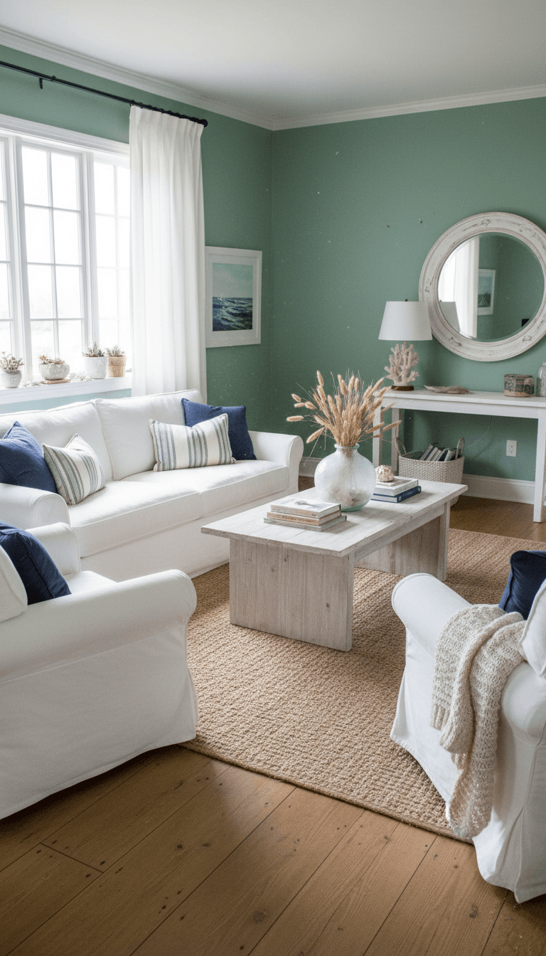
Minty seafoam brings a cool, coastal freshness that instantly lightens the mood of your living room. It pairs well with white, sandy beiges, and touches of navy, creating a space that feels like a spring beach day.
Cheerful Marigold
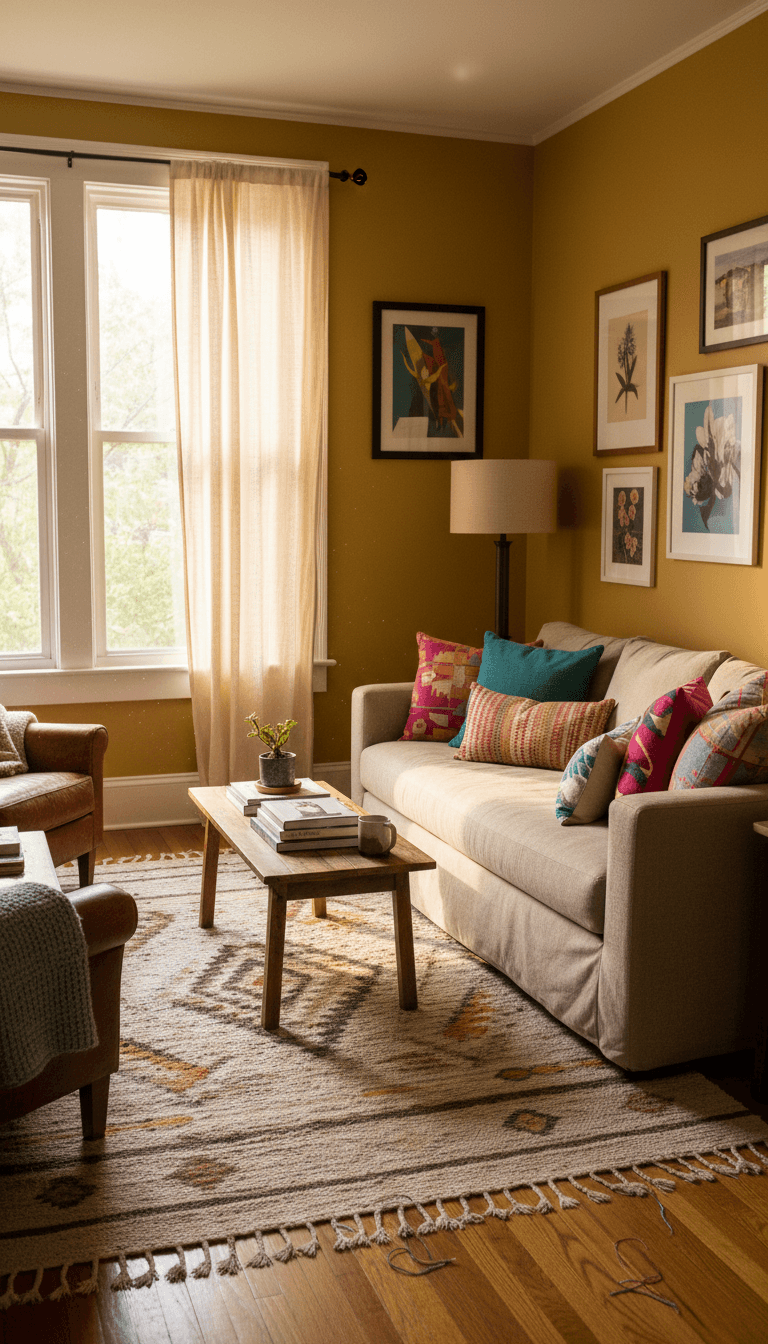
Marigold is a deeper, golden yellow that feels like warm afternoon light captured on your walls. It’s bold yet welcoming, especially when you temper it with lots of white, natural fibers, and simple, unfussy decor.
Cool Lime Sherbet
Lime sherbet is a zesty, energetic green-yellow that makes your living room feel lively and modern. It works best in bright spaces, where the natural light softens the color and lets it read as fresh and fun rather than intense.
Blushed Coral Glow
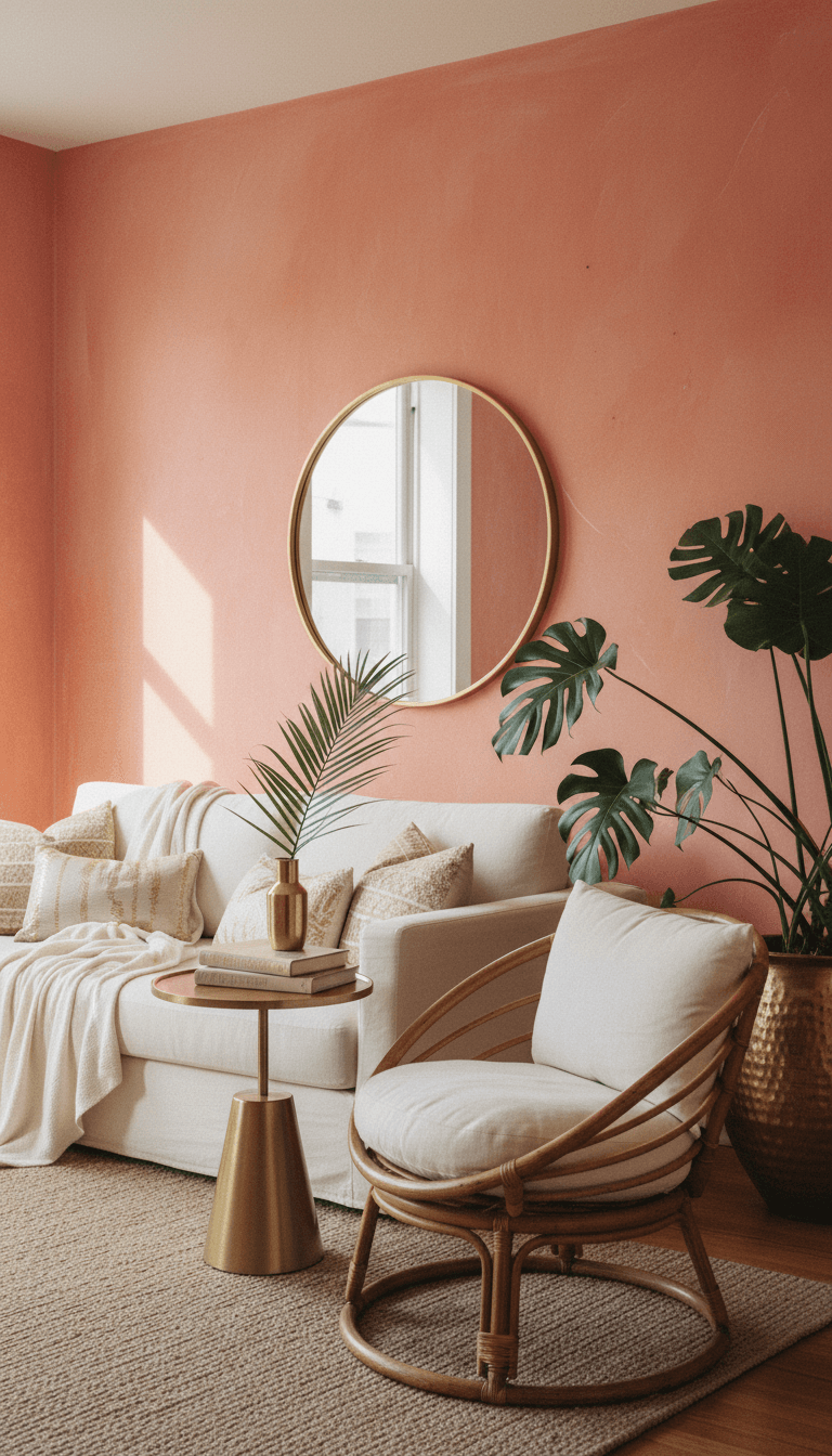
Blushed coral combines pink and orange for a sun-kissed, vacation-at-home feeling in your living room. It flatters most skin tones and makes gatherings feel instantly more festive, especially when styled with straw textures and warm metals.
Pale Daffodil Cream
Pale daffodil is a very light, creamy yellow that feels like a neutral with a happy twist. It subtly brightens even darker living rooms, adding a soft glow that works with both cool grays and warmer beiges.
Barely-There Blue Gray

A barely-there blue gray gives just a whisper of color while still reading calm and airy. It brings the freshness of spring skies into your living room in a very understated way, especially when layered with white, soft blues, and natural woods.
Conclusion
Refreshing your living room with a bright spring color doesn’t have to mean going bold wall to wall; even the softest pastel or a warm-leaning neutral can transform how the space feels. Think about the kind of mood you want—calm and breezy, warm and sunny, or playful and energetic—and let that guide your choice. With the right shade on your walls, your living room can feel like the best parts of spring, no matter what the weather is doing outside.